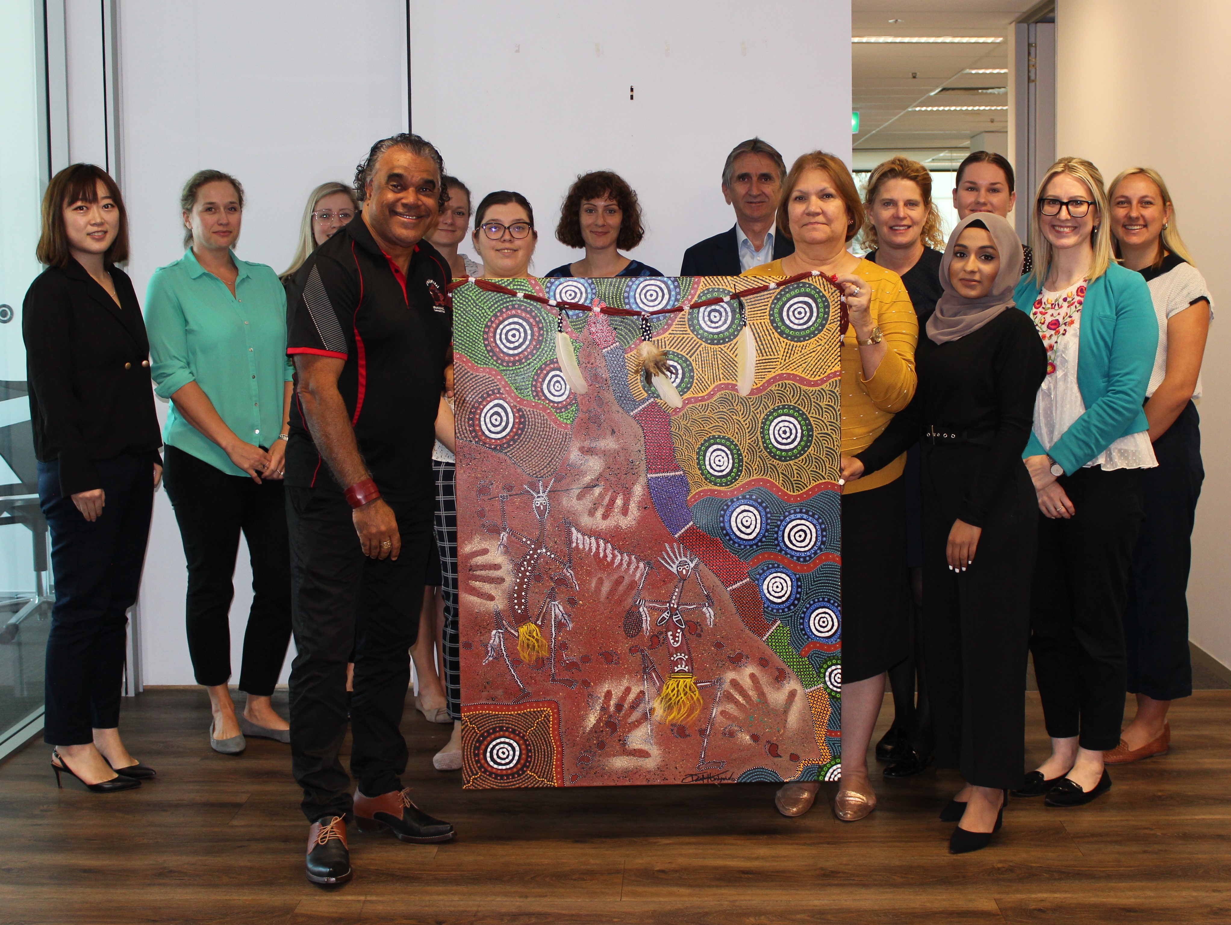
“This painting reflects many aspects of what Queensland and QTIC represent. The colours are reflective of the influences throughout. The underlying map of Queensland is broken into 10 sections for the 10th anniversary of the QTIC Champions Network formation,” said Mr Hudson.
QTIC Chief Executive, Daniel Gschwind said, “We are celebrating 10 years since the formation of the QTIC Indigenous Champions Network in Queensland which was established to provide insight, support and engagement for those looking to recruit and retain Indigenous employees in tourism.
“As the network evolved, its group of Champions has become the go-to Network supporting the sustainable growth of the Indigenous tourism sector and the employment of First Nations people across the state.
“QTIC promotes discussion regarding training and workplace opportunities within the tourism industry which has led to the drafting of the First Nations Tourism Potentials Plan, to be released at Destination IQ on 6 November”.
The artwork is layered with meaning and is a true representation of the journey undertaken by the Champions Network. Mr Hudson outlines some of the symbolism throughout.
“Goorialla-The Snake Creator hugs the Queensland coast to the top of Australia incorporating the Torres Strait Islands. The colours of the QTIC emblem are represented within Goorialla. This symbolises ‘The Voice of Tourism’.
“Brown – the land that we leave our footprints on – in all directions, East, West, North and South. Yellow – representing the sandy shores and our great sunny state of Queensland. Green and Blue – Islands from the south to the north, waters, reefs and oceans of Queensland and to the west of the gulf – green rainforest. Blue, green white and black - The Torres Strait Islands. Grey represents our wildlife for Queensland - koala and brolga.
“Circles of connection throughout – connecting many people and businesses – the many meeting places – dots representing people. Dancing figures – culture – men and women- holding a feathered ceremonial belt to connect them to the land and the importance of respect to culture and history to continue to move our cultural footprint forward. This also represents our partnerships and friendships and the feathers represent a symbol of respect and peace.
“Handprints – to protect us all as we journey forward – helping hands. Ceremonial belt – feathers – emu and cockatoo. Cockatoo – someone is coming - messenger bird. Emu feathers – an animal that can’t walk backwards – as with the emu QTIC’s journey is to go forward. Yundu Mai – Jinna La Galing – Happy trails and a safe journey for all,” said Mr Hudson.
The artwork is now proudly hanging in the QTIC office and will be on display at Destination IQ on 6 November.